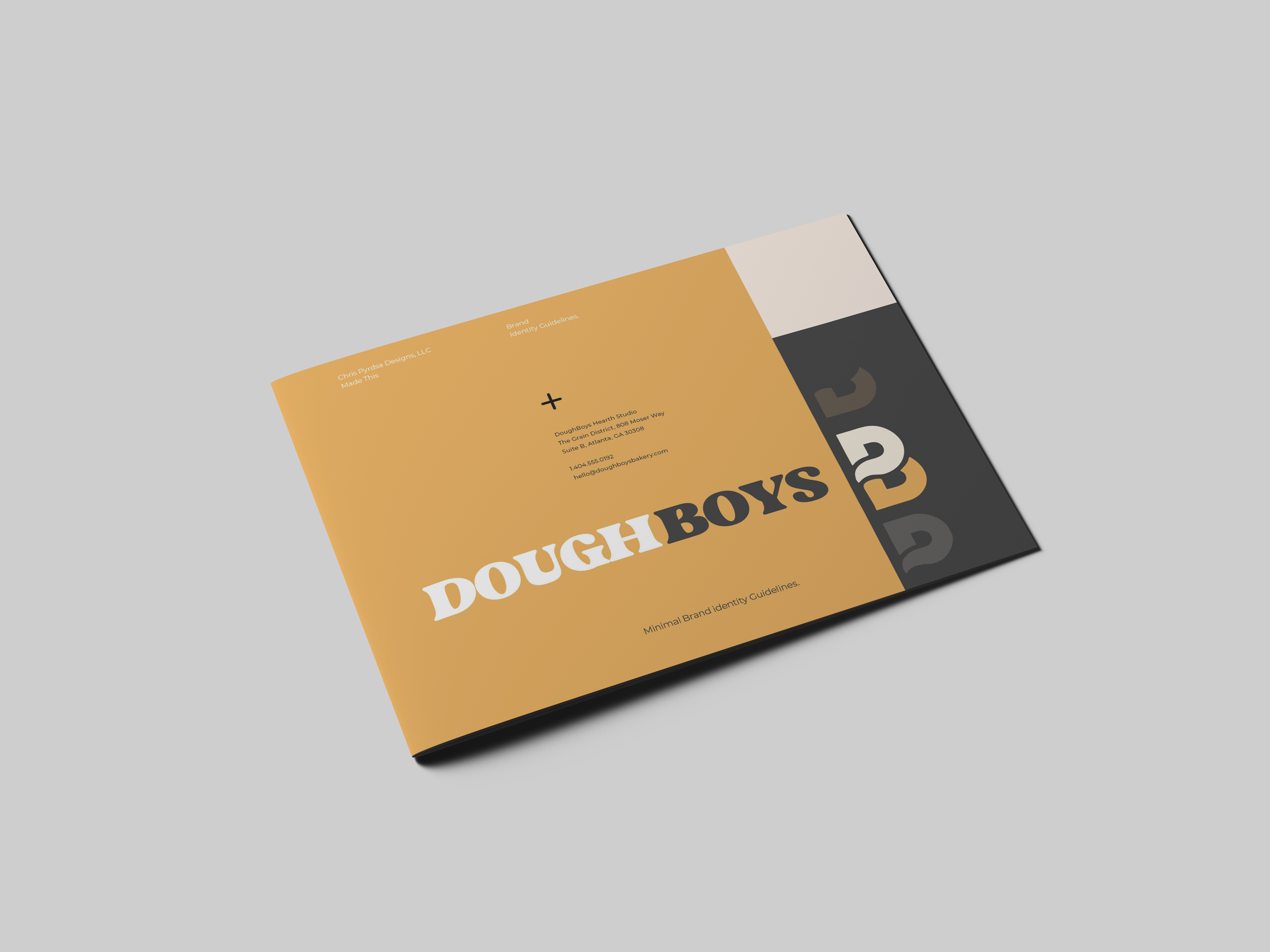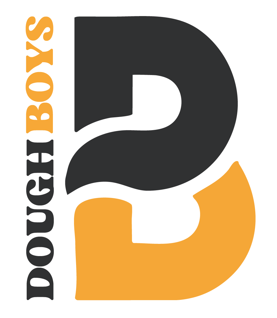
Doughboys Bakery: Logo
+ Branding
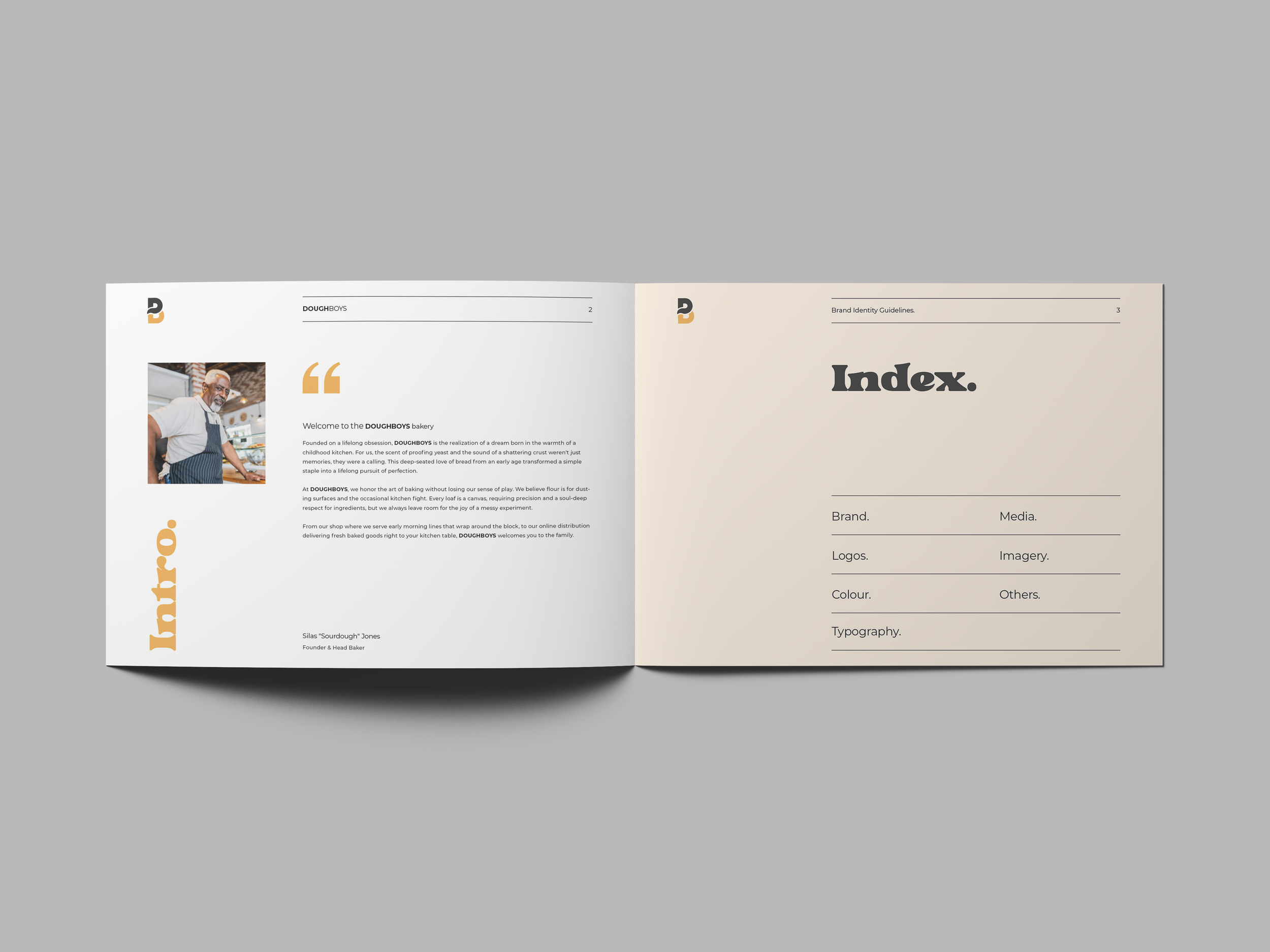
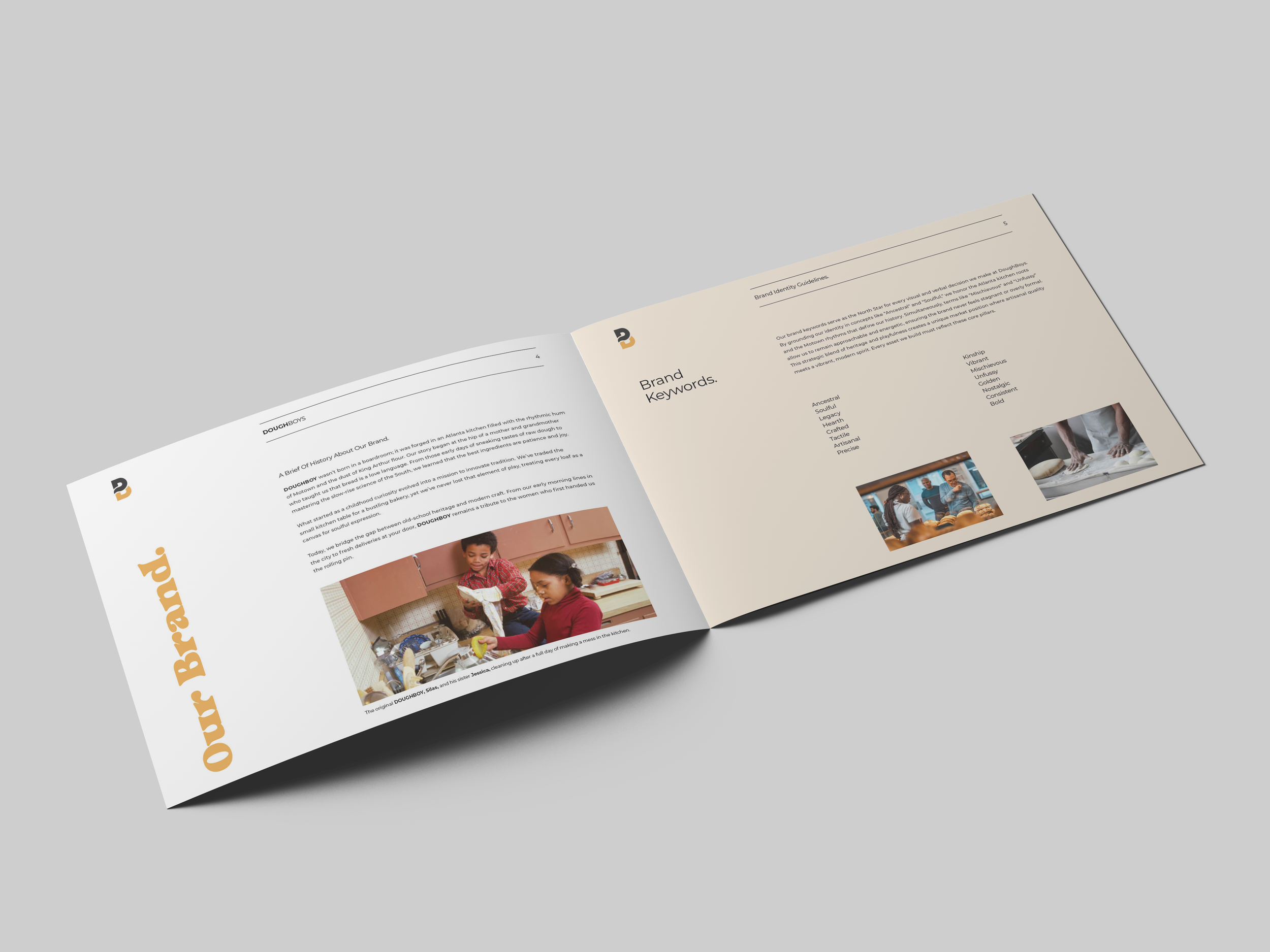
Doughboys needed a brand that honored heritage without living in the past. This is a bakery born from Atlanta kitchens, Motown mornings, and hands dusted in King Arthur flour, a love language passed down through generations.
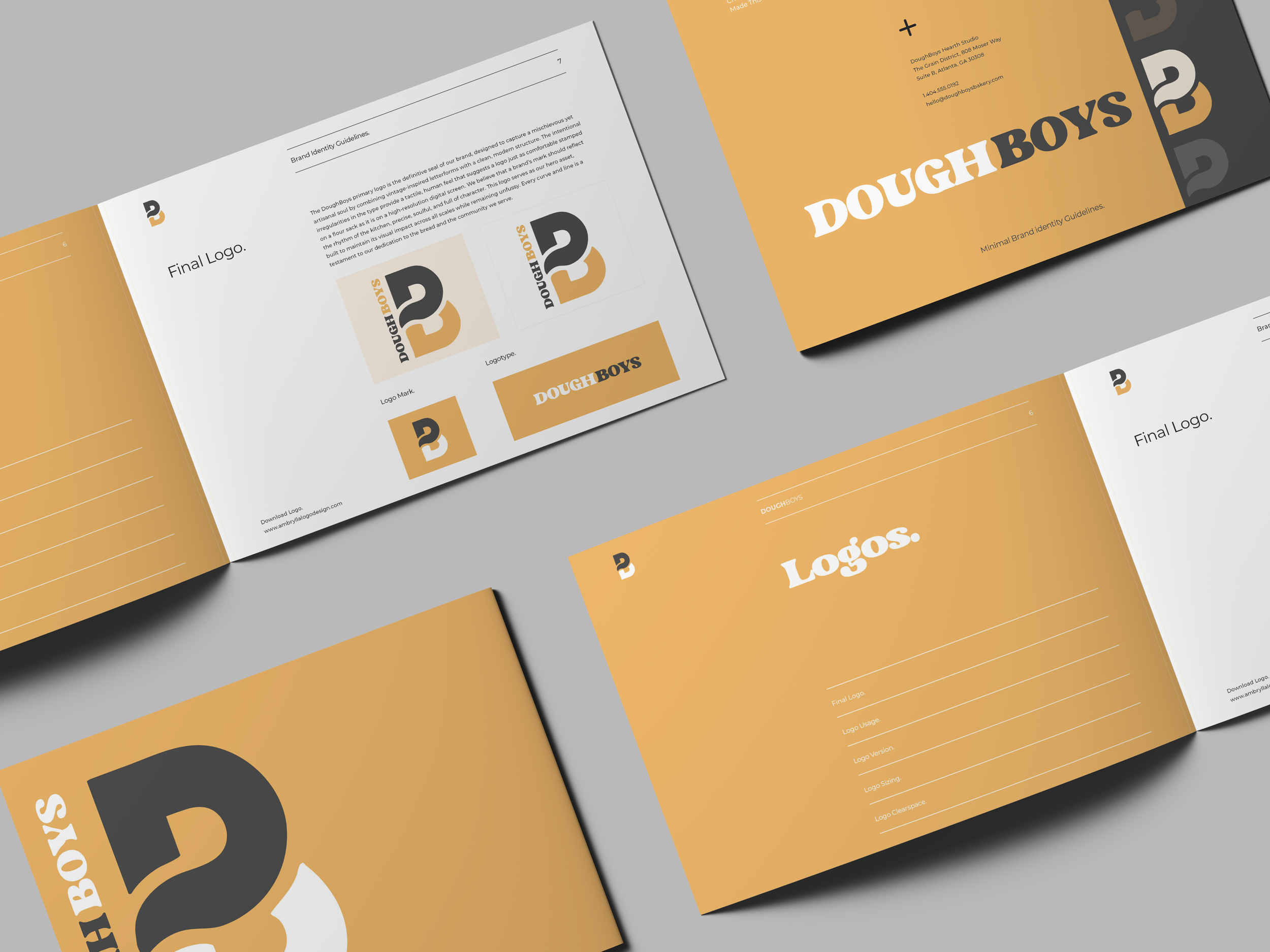
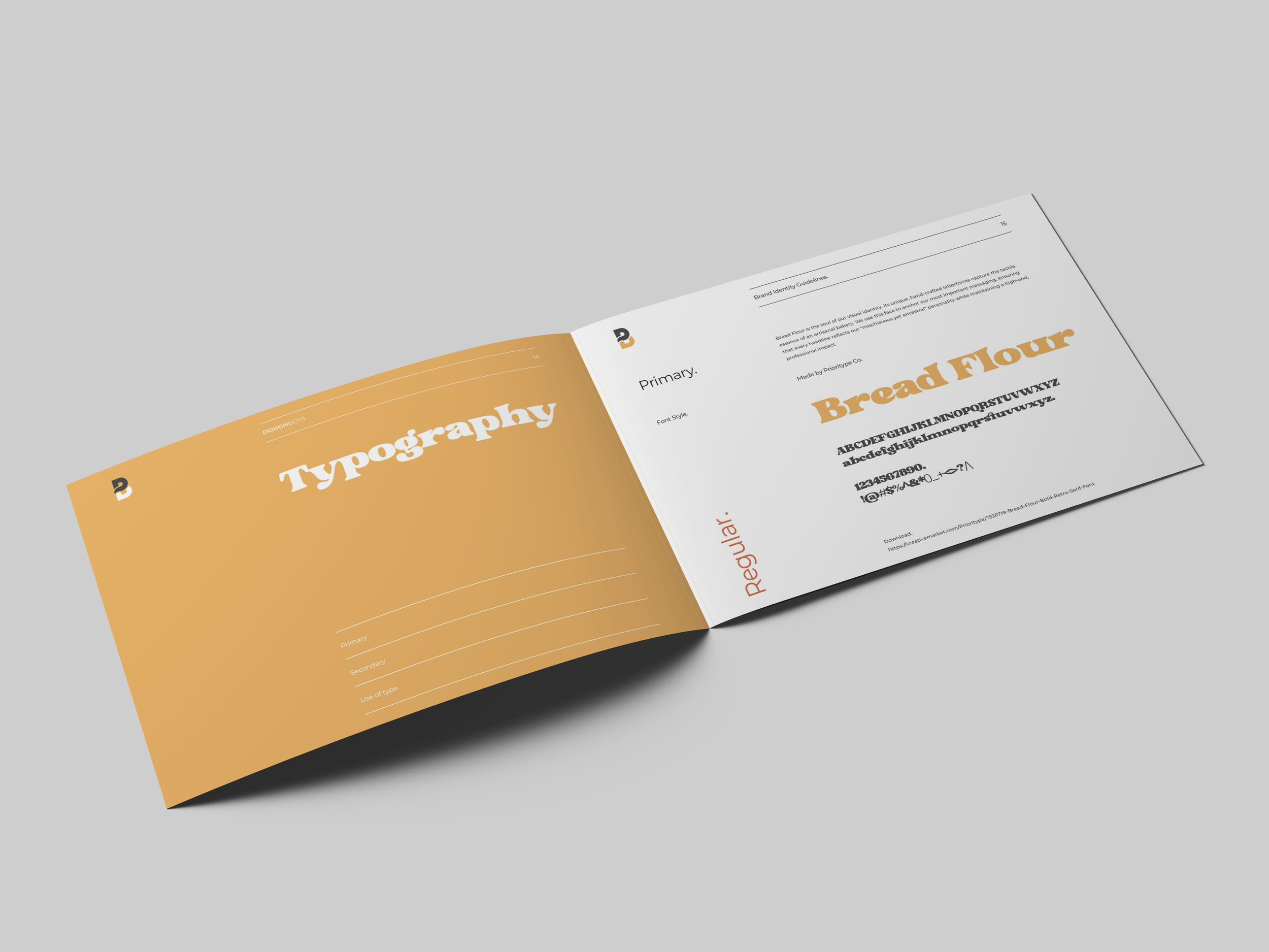
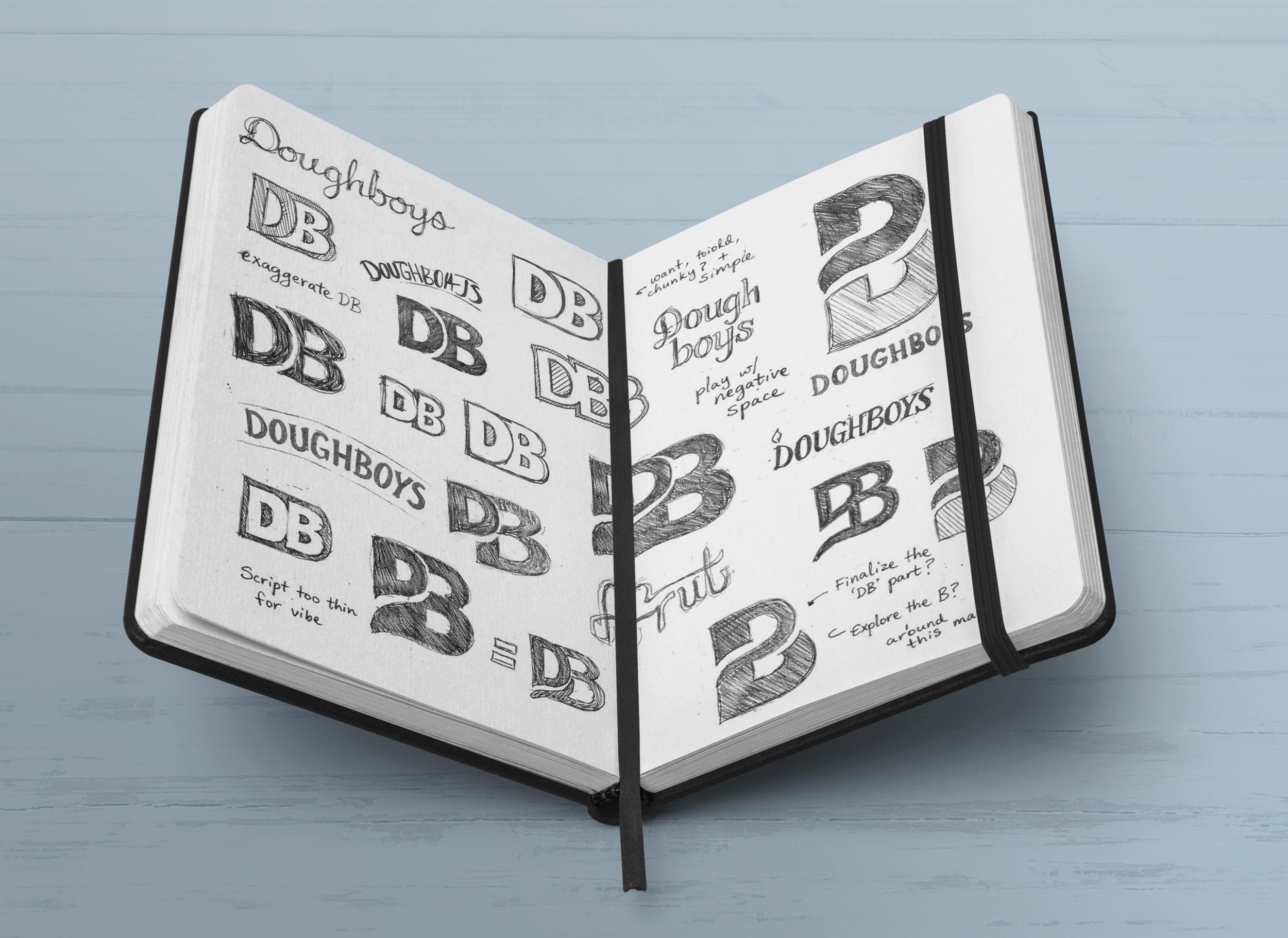
The identity plays with nostalgia while staying grounded in craft. The logo itself has a deliberately rough, hand-worked finish, edges that feel stamped, inked, or carved rather than digitally polished. It's the visual equivalent of flour on your hands and dough under your nails. That imperfection is intentional; it signals authenticity and the tactile nature of the work.
Bold, warm typography pairs with handcrafted iconography, rolling pins, ovens, rising dough. The color palette pulls from the product itself: honey bronze crust, linen countertops, graphite cast iron. Every element feels like it belongs in a bakery that takes its work seriously but never loses the joy of making something with your hands.
This isn't artisanal for the sake of trend. It's soulful, unfussy, and rooted in the kind of care that starts before sunrise.